In unserem nächsten studentischen Gastbeitrag geht es um eine Campus-Karte für Besucher mit eingeschränkter Mobilität. Auch dieses Projekt ist im Rahmen des International Master Programme in Cartography an der TU München entstanden.
Idea of the project
The idea of the project was to create an accessibility and navigation map of the Technische Universität München downtown campus designed for people with limited mobility. The target audience for the application are not intended to be map experts. Therefore, we used an Esri Story Map web application template in order to introduce our story and thus make the user experience as comfortable as possible.
The created interactive map helps the user decide how and from where to access a specific building and the floors in this building. For this purpose, we visualized points of interest which in turn will facilitate the user navigation. The points of interest are buildings in the campus and their entrances.
The information about accessibility of the buildings and their entrances is presented based on the points of interest. These points include information about the location of the elevators and accessibility of floors in each building in order to make navigation between the buildings level and the indoor level easier. We added textual descriptions and photos to the selected points of interest in order to facilitate the user’s interaction.
According to the type of information conveyed to our users and the essential components of our story, we decided to use the Story Map Shortlist template. The Shortlist app organizes points of interest by tabs where each point of interest is represented with a pop-up window containing picture, title, short description and – in case of details – comprehensive description, address and opening hours.
Project milestones
At first, we located points of interest based on the collected data in ArcMap. We used the corresponding coordinates for the point layers in the web map. For each point of interest we filled in the default and some of the optional fields in the provided Excel spreadsheet (Figure 1). This spreadsheet defined the content of our pop-up windows.
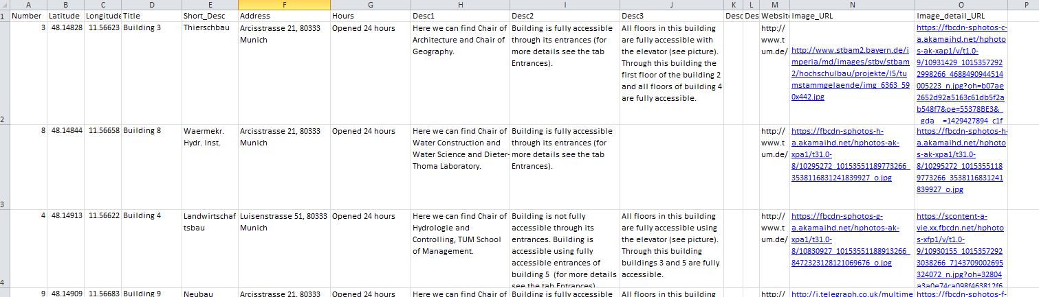
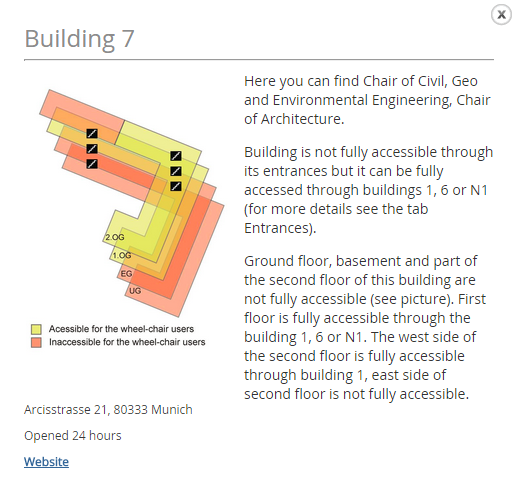
For representing a detailed description of each point of interest and adding a sketch for each building, we enabled the optional details panel. After completing the spreadsheets, we created a web map in ArcGIS Online, chose one of the available basemaps from ArcGIS Online and uploaded CSV files for the Shortlist point layers into the map. Each CSV file represents one group of points of interest (building and entrances) in the application shown as two tabs. The points of interest pop-up window of the Buildings tab includes information about the building’s name and number, its address, opening hours, a link to the website, a photo, a sketch and a description. In the detailed description the users are able to get information about the university departments housed in the building, from which other buildings it is fully accessible, which of its floors are fully accessible and from where. For better understanding of the detailed description and for better orientation, the sketch of the building is shown aside (Figure 2).
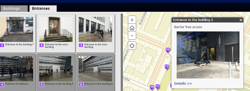
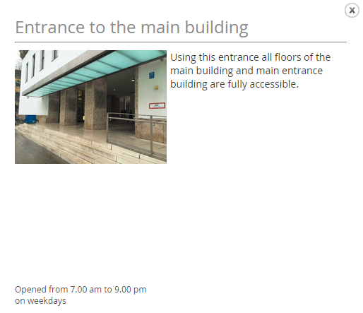
The pop-ups of the Entrance tab include information about accessibility of the entrance and the floors in the building, a photo of the entrance and its opening hours (Figure 3).
Conclusion
Additionally, we customized the colors and style of the banner for the story map to make the application more visually appealing. To design the web application, we took into account Technische Universität München corporate design colors and changed the header background color, font color, tab color, the thumbnail background and the header divider accordingly. Therefore, we edited the custom CSS to change the default design of the application.
The created story map web application is the first description and visualization of accessibility for Technische Universität München downtown campus. As such, it allows an easier exploration of the campus and gives information about the accessibility of building and floors to the user. In further developments of the Story Map web application, we would like to include the possibility of navigation from a selected start point to a desired destination and show the route on the map. As for the current usability of the app, we think that the Esri Story Map Shortlist web application is the appropriate tool to tell our story.
To see the story map click here.
Authors
Aleksandra Draksler
Rohini Gangaputra
Furui Sun
Students of the 1st semester of the International Master Programme in Cartography
Technische Universität München